Stephen Blyth, Community Research’s communications and fundraising manger, reports on the Nonprofit Technology Conference, he attended in Washington DC, 13-15 March 2014.
Whether data is recorded and analysed for fundraising, advocacy, communications, reporting or even actual service delivery, the topic of research was on the lips of many at the annual Nonprofit Technology Conference.
Of course, many people wanted to get their hands on data mainly to help them engage more or raise heaps for their cause. There were sessions on giving trends, web analytics, social intelligence wizardry and ROI.
As well as the 100 plus formal sessions at the three-day conference, there were side talks by some of the 147 exhibitors in the science fair, and chats with many of the 2120 participants in the snaking hallways at the Marriott Wardman Park.
Highlights of a traditional research nature included learning about data visualization, seeing how software can support program evaluation, and marrying analysis to storytelling.
I left the 90-minute session on “DataViz! Tips, Tools, and How-tos for Visualizing Your Data” with a concrete set of steps to use when creating graphs, charts and other diagrams. This was run by Ann K. Emery and Johanna Morariu from Innonet, and Andrew Mean, Data Analysts for Social Good.
All too often people can misinterpret or miss the true meaning of statistics presented in graphs. Cluttered design with too many labels confuses people. To ensure the meaning is clear, Anne and her colleagues suggest a tidy up.
The presenters walked through a seven step Dataviz Design Process not once or twice, but three times, so it really sunk in. The steps are:
- Select your story
- Reduce the clutter
- Directly label
- Emphasise key findings with colour
- Summarise your story in the title
- Are you doing it right? (Or get feedback on a draft).
- Share.
A list of practical tools, before and after examples, and a blog post about the session are listed below.
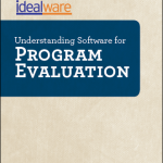
Understanding and demonstrating the impact of an organisation’s work was the focus of a session by Laura Quinn and Elizabeth Pope from Idealware.
To bring to life a document that Idealware released in August 2013, the two Idealwarits ran a session on “The Proof is in the Program Evaluation: Applying the Idealware Program Evaluation Pyramid”.
After describing a fairly typical evaluation hierarchy (with outputs at the bottom and attributable impact at the top), a framework for understanding how software can be used was provided.
Tools fall into five categories: central hub of program data; auxillary data systems; proactive data gathering; external data sources; and reporting and visualizing.
Piecing together the overlapping aspects of impact measurement maybe useful to organisations in New Zealand, even if some of the specifics don’t apply.
While I missed the many formal sessions on storytelling, a chance encounter with Marc Maxson, an innovation consultant with Global Giving, provided insight to drawing out meaning from stories.
Global Giving have been pioneering the use of story collection and analysis with projects using their donation platform. The central idea is to support grassroots organisations to gather short narratives from people in their communities, then allow common patterns to emerge and “a common voice can rise above the hubbub”.
The approach was started off in Kenya, Uganda and other southern countries, but is being adopted by organisations around the world.
There’s a wealth of information about the Global Giving approach available online, including recent blog posts by Marc himself.
It’s to a conference speaker Craig Sinclair that I’ll turn for a conclusion about this very large but open conference: “It felt like conversations were trailed by floating Creative Commons licenses as people happily contributed perspectives while testing their own ideas and creating their own variations.” Thanks @NTENorg for running such a great hui!
Acknowledgements
Thanks to Community Research for supporting me on my travels, TechSoup Global for financial support, and my whole damn family for letting me go.
Resources
#14ntc trip documentation by Stephen Blyth
Some nuggets from #14ntc, in Washington DC
Reflecting on climate change and #nptech
Attending NTC in person, in Washington DC
In other words, linking to the #14ntc
Data visualisation tips, etc
Tips, Tools, and How-tos for Visualizing Your Data:
Presentation – very detailed, so actually a useful guide
Handout
Session notes (collaborative)
Ann K Emergy blog post about the conference
Idealware of programme evaluation software
The Proof is in the Program Evaluation: Applying the Idealware Program Evaluation Pyramid presentation (PPT, 7.4MB)
Understanding Software for Program Evaluation
The Reality of Measuring Human Service Programs: Results of a Survey
Global Giving storytelling project
Storytelling approach and tools
The “Real Book” for story evaluation methods
“How organizations are adopting the storytelling method to their local context” by Marc Maxson